Carver Twins Real Estate

We put the win in twinning
DELIVERABLES
• Brand Strategy / Logo / Brand Identity
• Business Cards / Letterhead
• Photography
• Web Design / Web Development
• Marketing Campaign
The Carver Twins are best know for their fun, hands-on approach to guiding their clients through selling and purchasing in one of the most competitive real estate markets in history. They believe that success comes from listening first. They work tirelessly to understand what each of their client’s unique personality and goals are, then craft a process that will serve them best. The Carver Twins are certified, strategic negotiators, trained to help identify and minimize risk in highly-emotional scenarios.
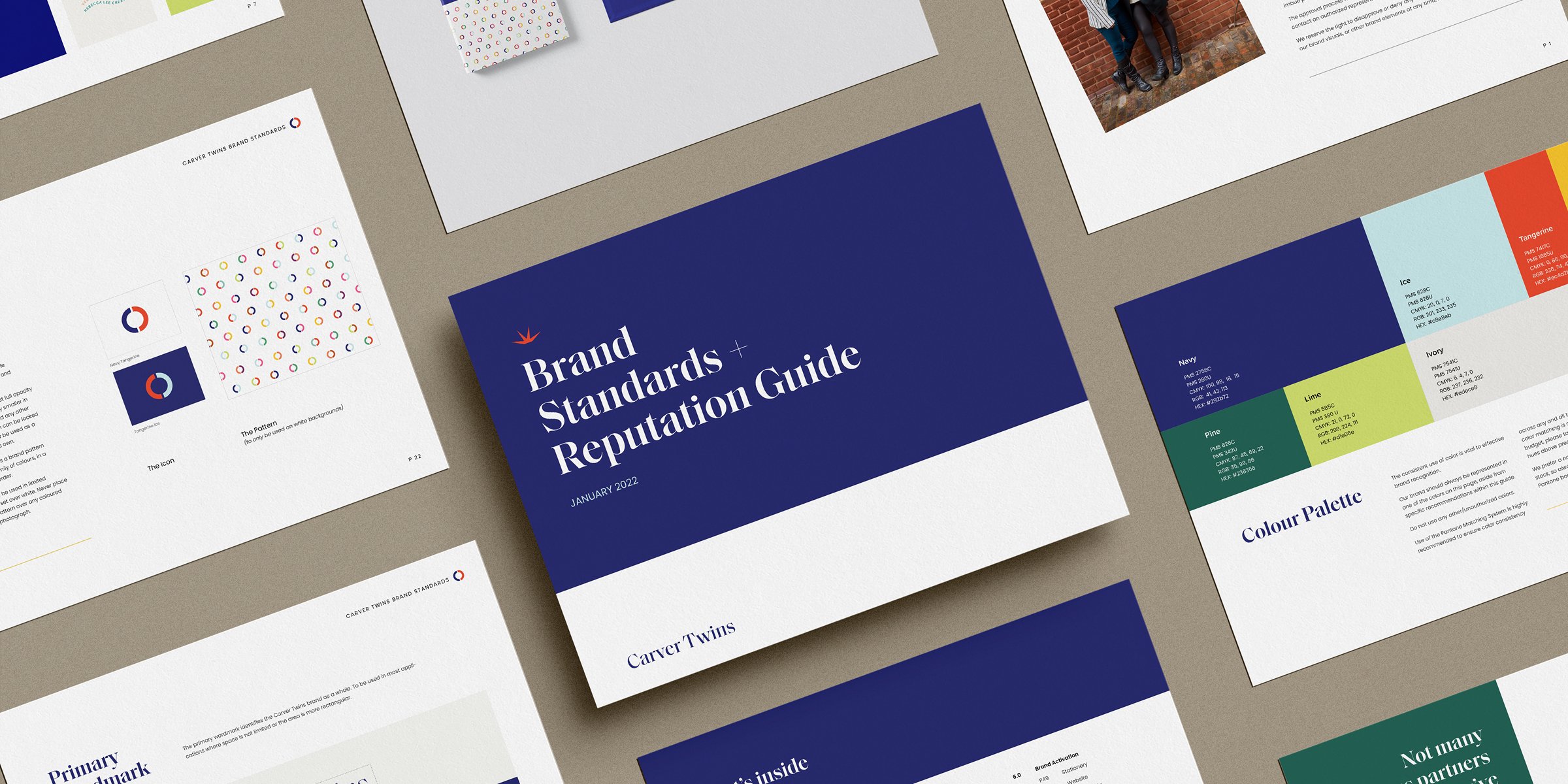
But there is always two sides to every coin. Although they are serious about what they do, boy do they have fun doing it! The goal of the re-brand was to encapsulate the overall feeling of sophistication and whimsy. Clean, professional and elegant—while at the same time bring a feeling of happiness and joy. A bright spark of personality to encapsulate the personality of the twins themselves.
We accomplished this through the elegant and overly decorative primary typeface (sophistication), and the robust, joyful colour palette and patterns (whimsy). Our inspiration was that of high-end packaging. The kind you find and you just have to buy the product, not really caring if what’s inside is even any good. It just makes you happy to see it. We then layered in fun copy and sharp new brand photographs.