Edinburger Ottawa

Services
Brand Strategy
Brand Identity
Packaging Design
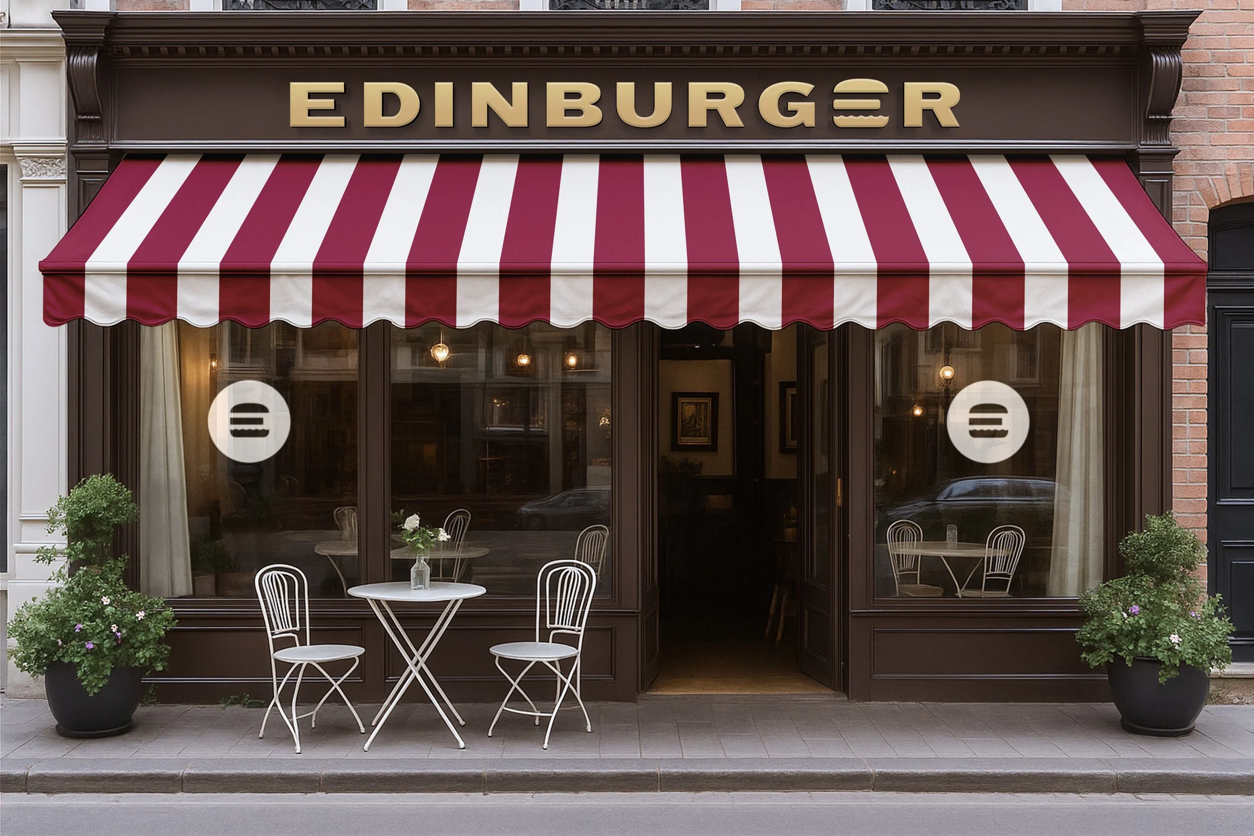
Signage & Environmental
Overview
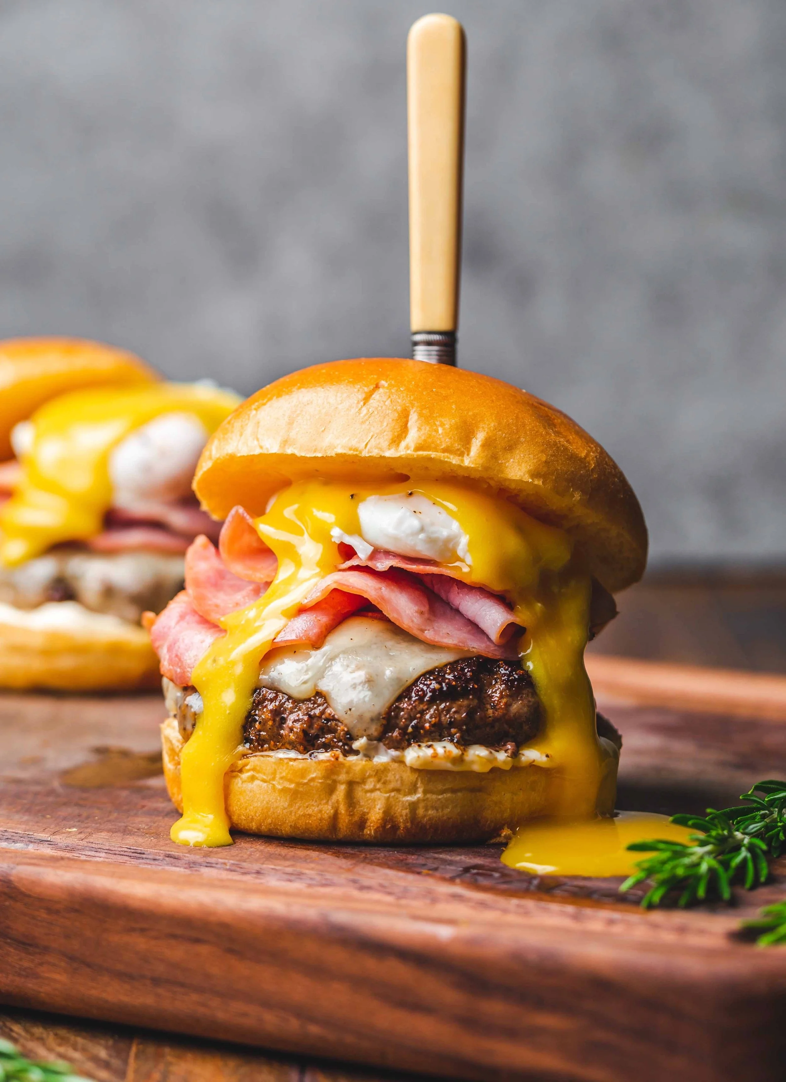
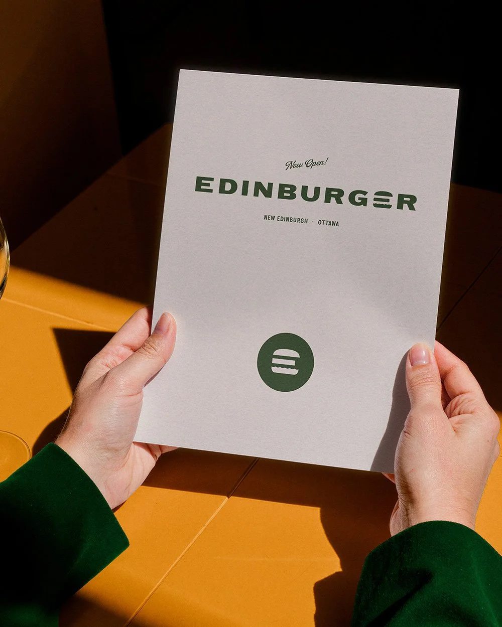
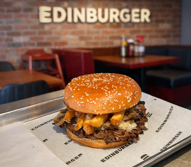
Edinburger is a burger restaurant in Ottawa's New Edinburgh neighbourhood — a name that does double duty, nodding to both the locale and the product on the menu. The concept centres on classic griddle burgers, shakes, and fries, served fast and made with care.
In a category dominated by primary reds, yellows, and cartoon mascots, how can we build a brand that customers would be excited to sport on a t-shirt or ball cap? How can a burger brand become an icon admired to the same degree as the Nike swoosh? Not only did the new logo achieve this, but it also won a spot in the LogoLounge Book 15 Winners Gallery.
Objective
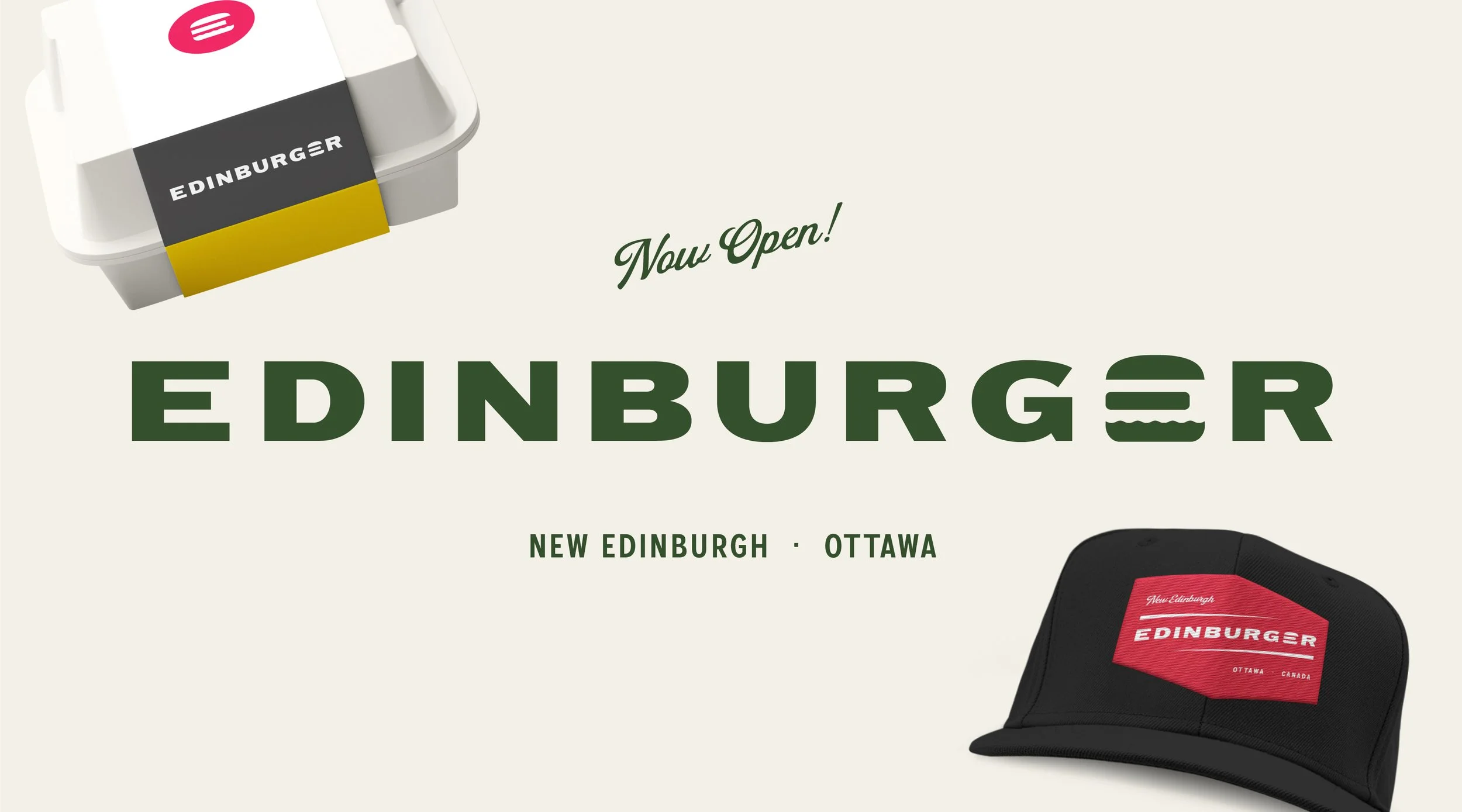
Design a brand built around a single, ownable mark. The wordmark sets Edinburger in a wide, confident sans-serif — with a custom burger icon swapped in for the letter "E." That icon is the whole game: it works inside the wordmark, pulls out cleanly as a standalone symbol for social avatars and packaging, and stamps onto a hat patch or t-shirt without explanation. One shape, endlessly reusable.
A colour palette built from the burger itself: Relish green, Pickle, Mustard, Ketchup, and Retro Orange, anchored by black and a warm off-white. The combination borrows from mid-century sign painters and print shops rather than fast food playbooks — retro without being a costume and distinct enough to remember. The script accent handles "Now Open!" and "New Edinburgh" call-outs, giving the brand a hand-painted, locally-owned warmth that the sans-serif alone couldn't carry.