Thurston Olsen Real Estate

Yeah, we know this city
DELIVERABLES
• Brand Strategy / Logo / Brand Identity
• Marketing Campaign / Billboards
• Business Cards / Letterhead
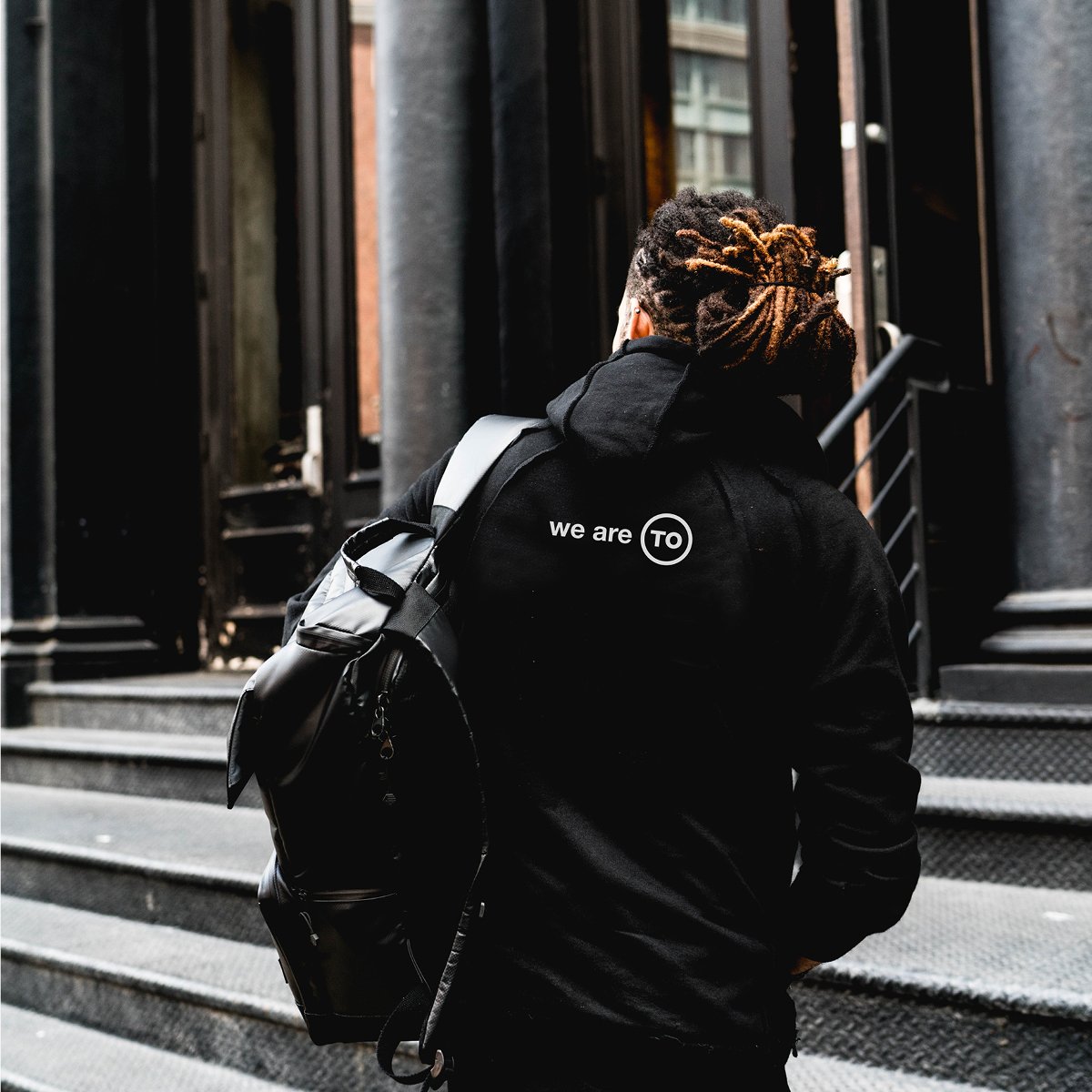
After approximately 8 years together, Thurston Olsen decided their old logo wasn’t quite working as hard as it could be for them. They hired M81 to develop a new brand identity that was representative of their successful, well-established real estate group. Something a bit more refined and cohesive. The team is well known for their top-notch services, such as luxury staging, that often result in sale prices well over the industry standard. On the other side, they are also known for their friendly, down-to-earth personalities.
One of the inspirations for the brand came from their love of local brew pubs. In the past, beer breweries and beer swag was a little unrefined. But over the past couple of years a new approach to craft beer had created a cult following. People enjoyed representing their local brewery, wearing swag and sharing pictures on social media. The duo thought that if breweries could change the publics view on how we felt about them, why couldn’t real estate? The goal was to create a brand that was “cool” enough, people would want to wear the branded swag proudly.
Fortunately, the Thurston Olsen brand’s monogram is TO and this connects perfectly to the city in which they practice, Toronto. With a play on words the tagline “We are TO” was born. The hope was that clientele that worked with Thurston Olsen would not only connect with their services and brand, but also be proud home owners in the city of Toronto. Therefore, when adorning anything branding with the TO mark it would have that multi-level meaning.