Unmet
Services
Brand Strategy
Brand Identity
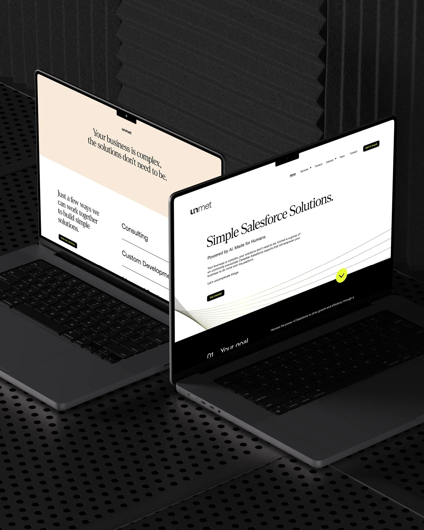
Website Design
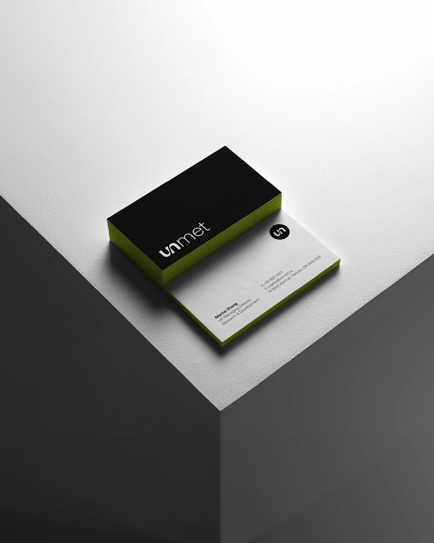
Stationery
Overview
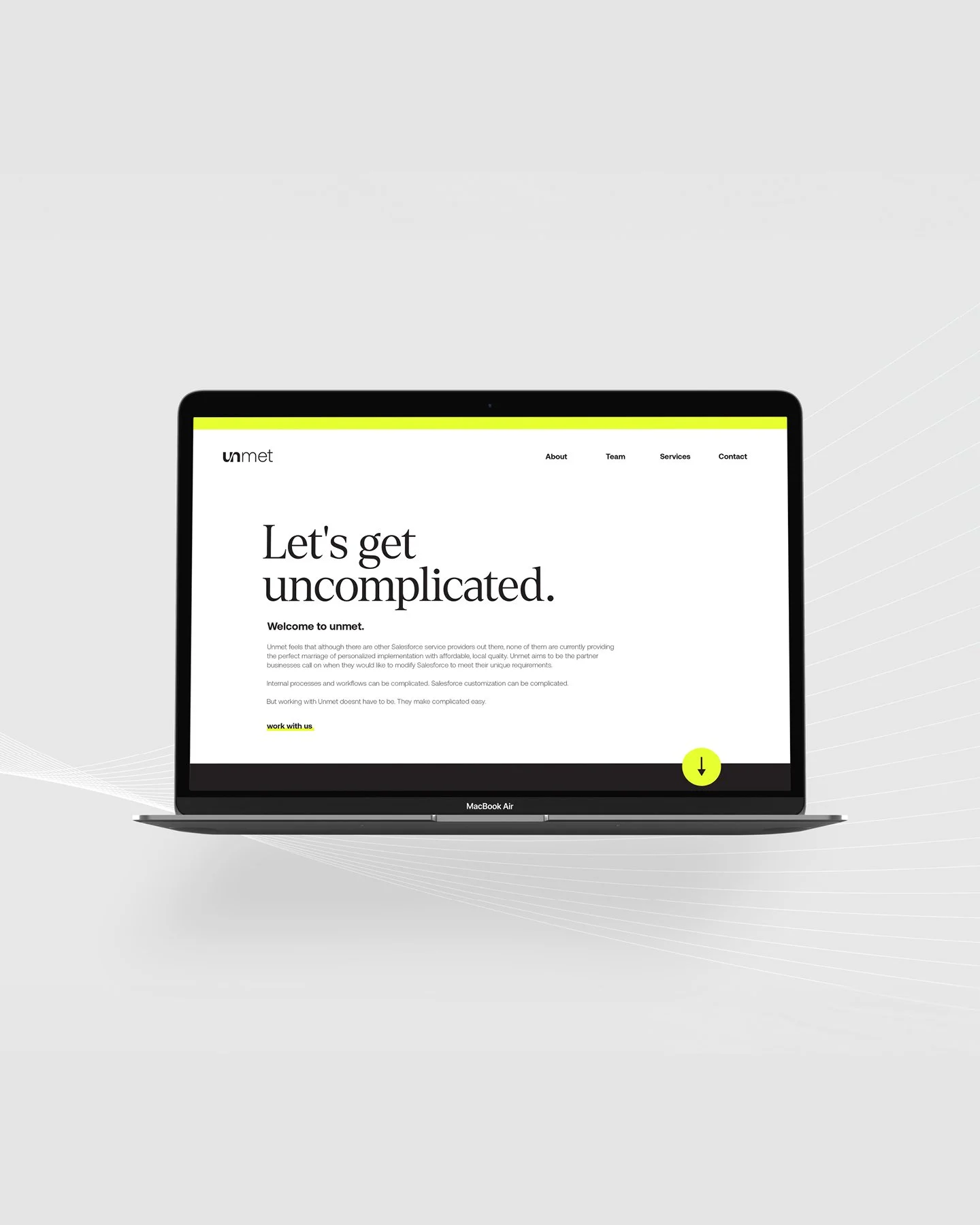
The success of Unmet was born out of a simple but powerful belief: that working with a Salesforce partner shouldn't be as complicated as Salesforce itself. Built by a team of developers who spent years solving custom problems for real clients, Unmet brings a hands-on, prototype-first approach to every engagement. Rather than lengthy scoping documents and drawn-out proposals, they jump in alongside their clients and build toward the answer together. It's a partnership model rooted in trust, clear communication, and the confidence that comes from doing the work — not just planning it.
Objective
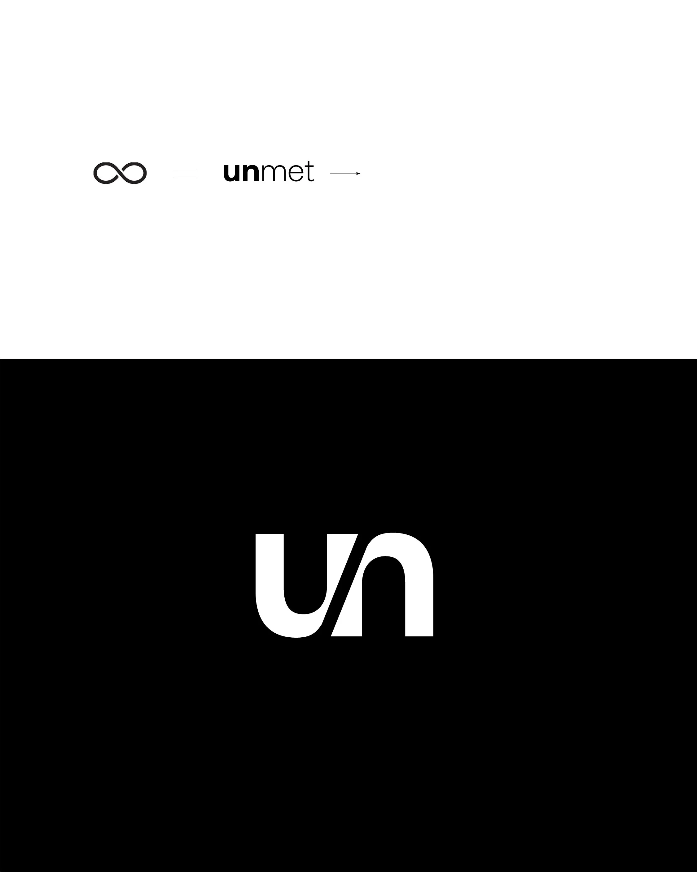
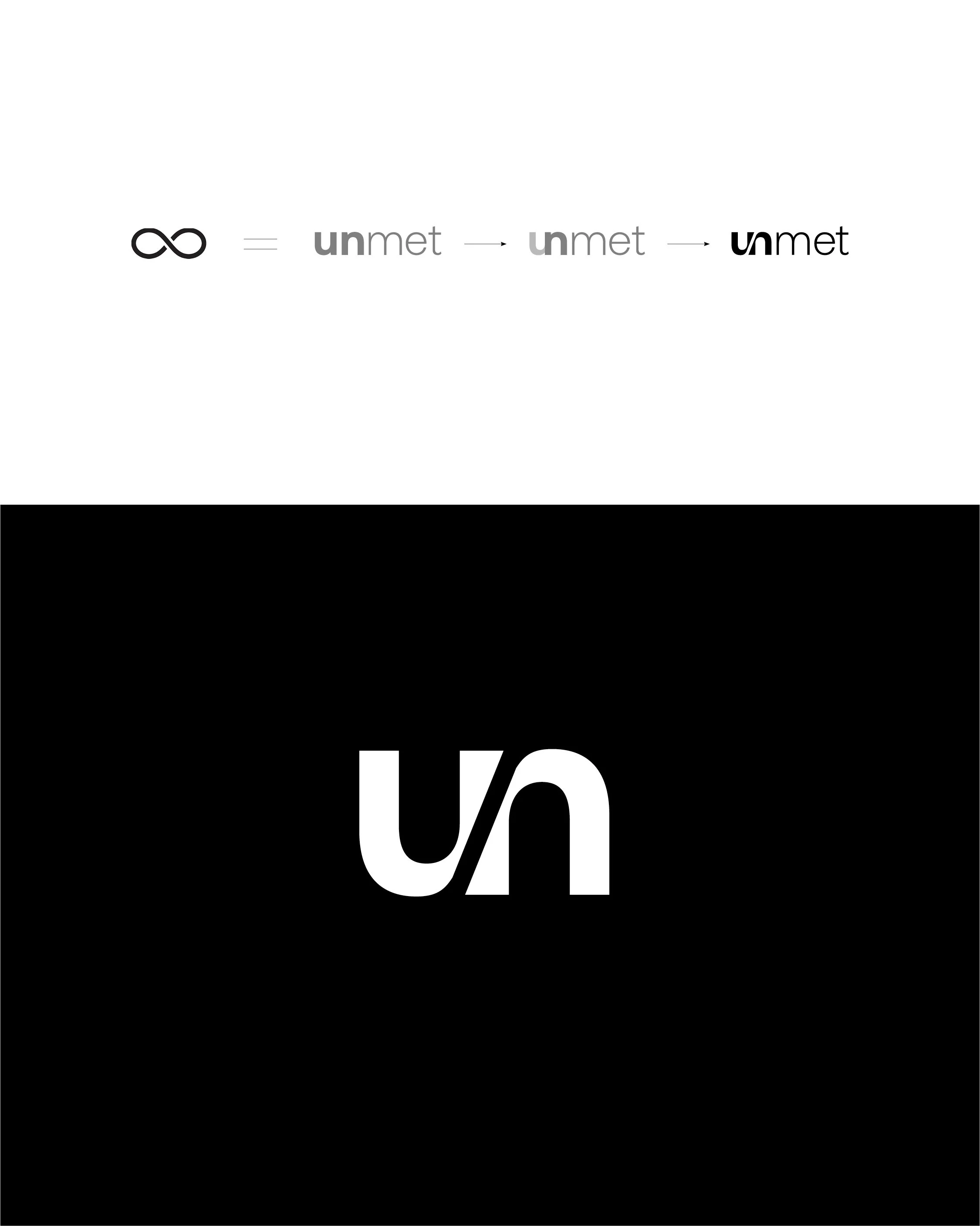
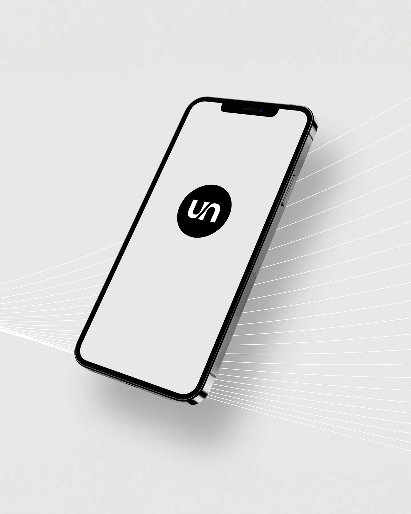
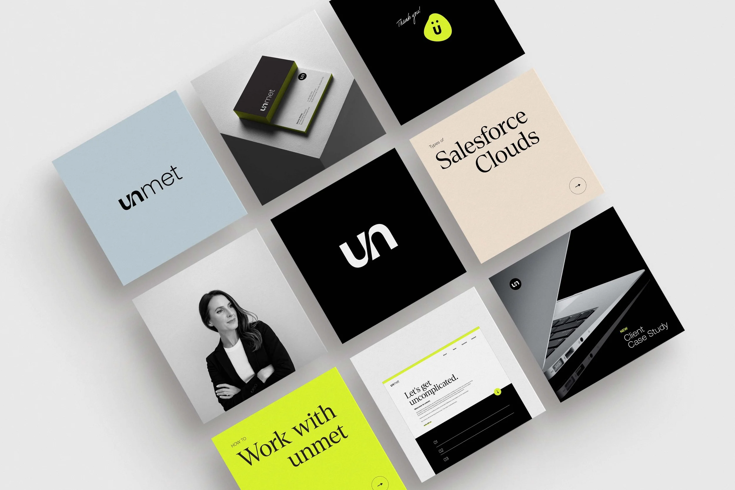
The visual identity leans into a primary palette of black, white, and electric yellow — clean and direct, with just enough energy to signal momentum. The "UN" wordmark expresses the brand's core idea of continuous flow: two letterforms connected, moving forward together. Typography pairs a modern sans-serif workhorse with a warm serif headline face, reflecting the balance Unmet strikes between technical precision and human approachability. The brand should feel uncomplicated to encounter — because that's exactly what Unmet promises to be.