The Beechwood Diner
Services
Brand Strategy
Brand Identity
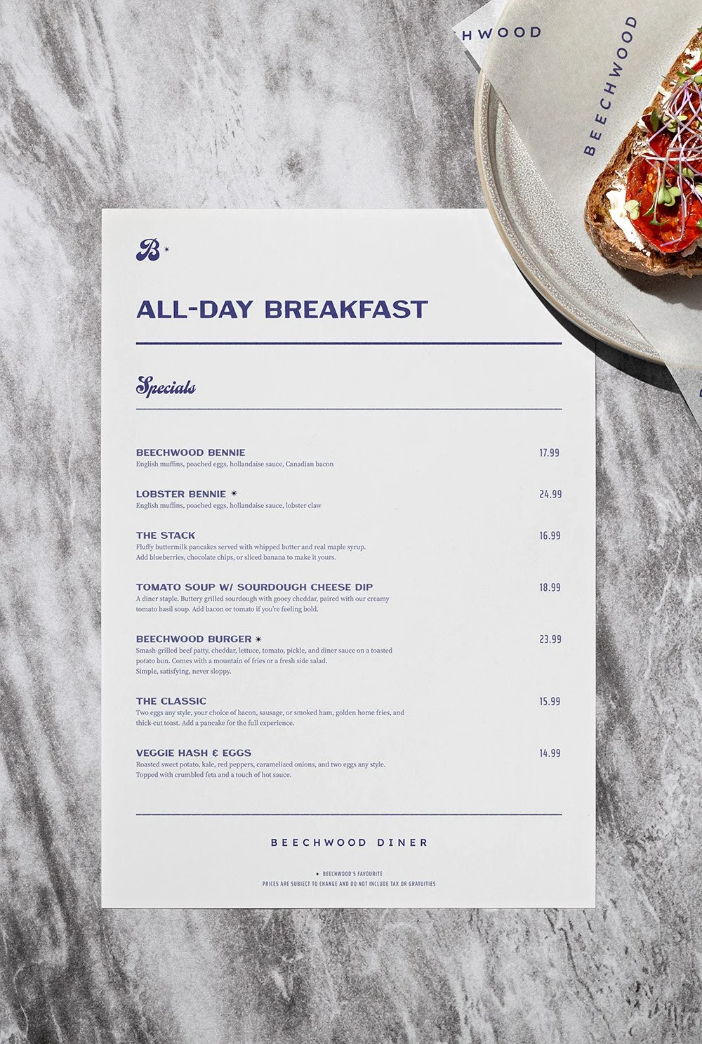
Menu & Print Design
Signage & Environmental
Social Media Templates
Overview
The Beechwood Diner is a full-service neighbourhood local in Ottawa's Beechwood community, reviving the spirit of the classic all-day diner with chef-driven comfort food, fresh coffee, and warm hospitality. The only diner of its kind in the area, filling a long-standing gap for a true "third place" — somewhere between home and work where neighbours, retirees, business leaders, and young families can converge over a real meal.
How do you honour the nostalgia of a classic diner without falling into the clichés of red vinyl booths and neon signage? How do you build a brand that feels both lived-in and elevated — familiar to the regulars, yet design-forward enough to stand out in a city of greasy spoons and fast-casual sameness?
Objective
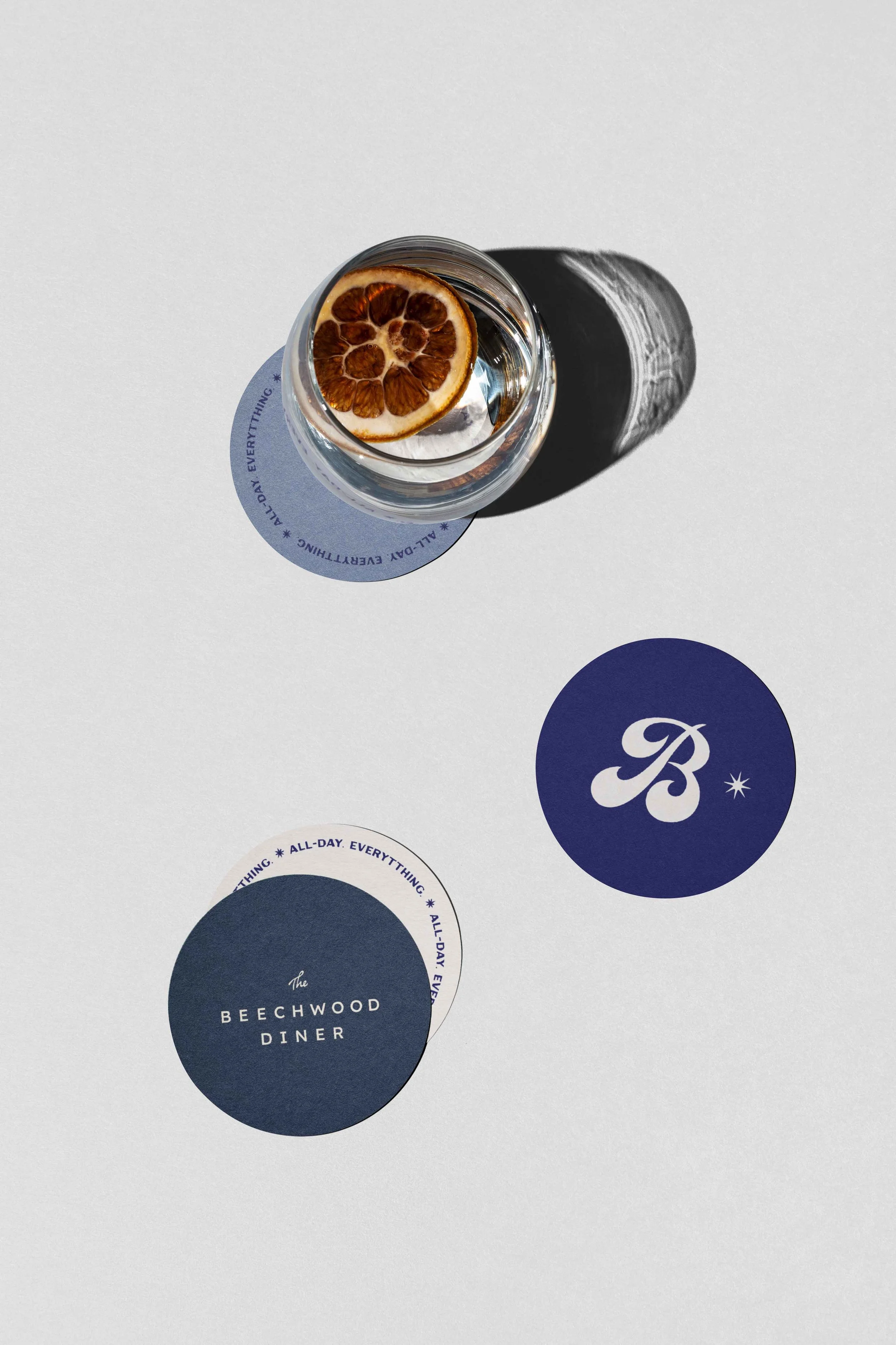
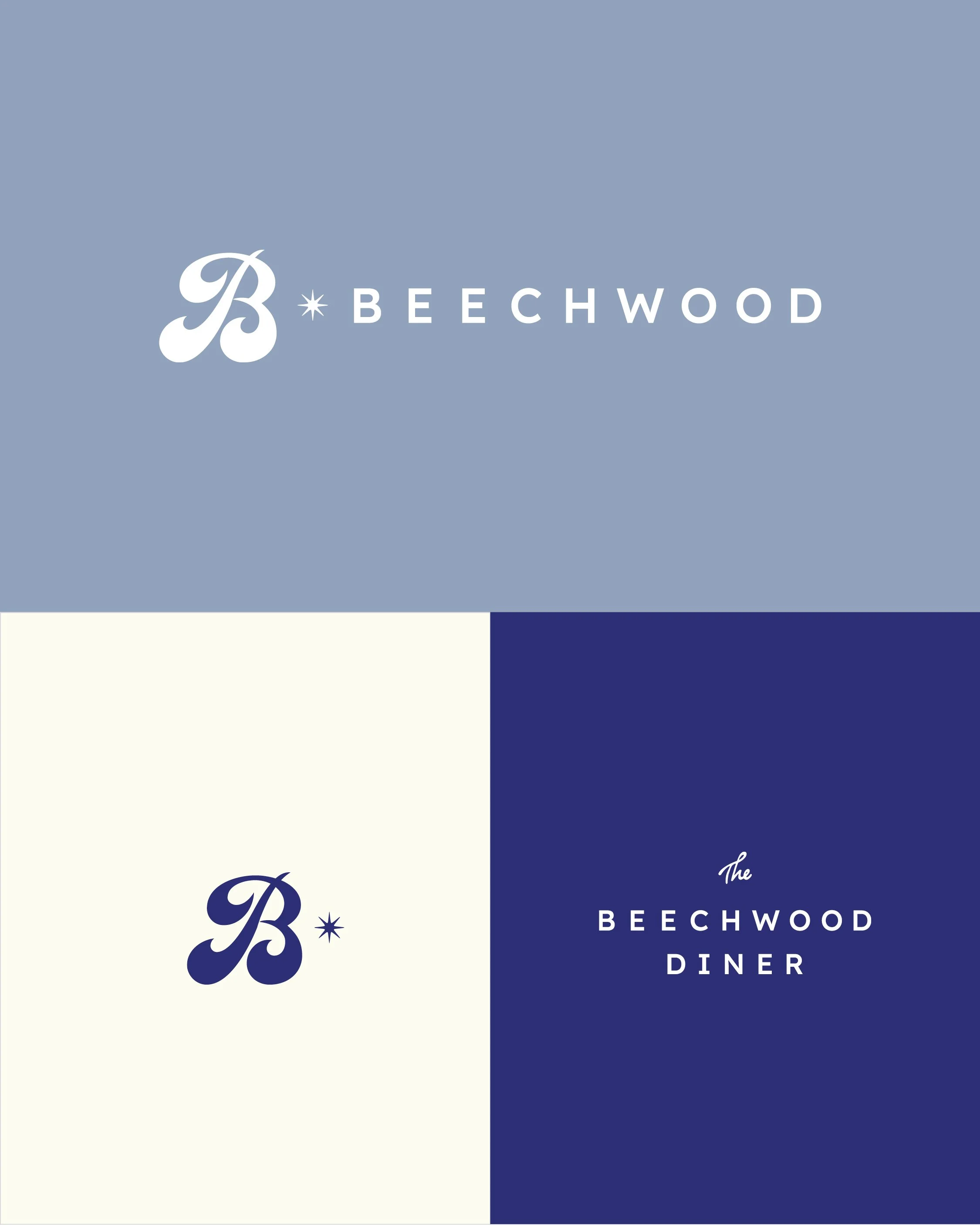
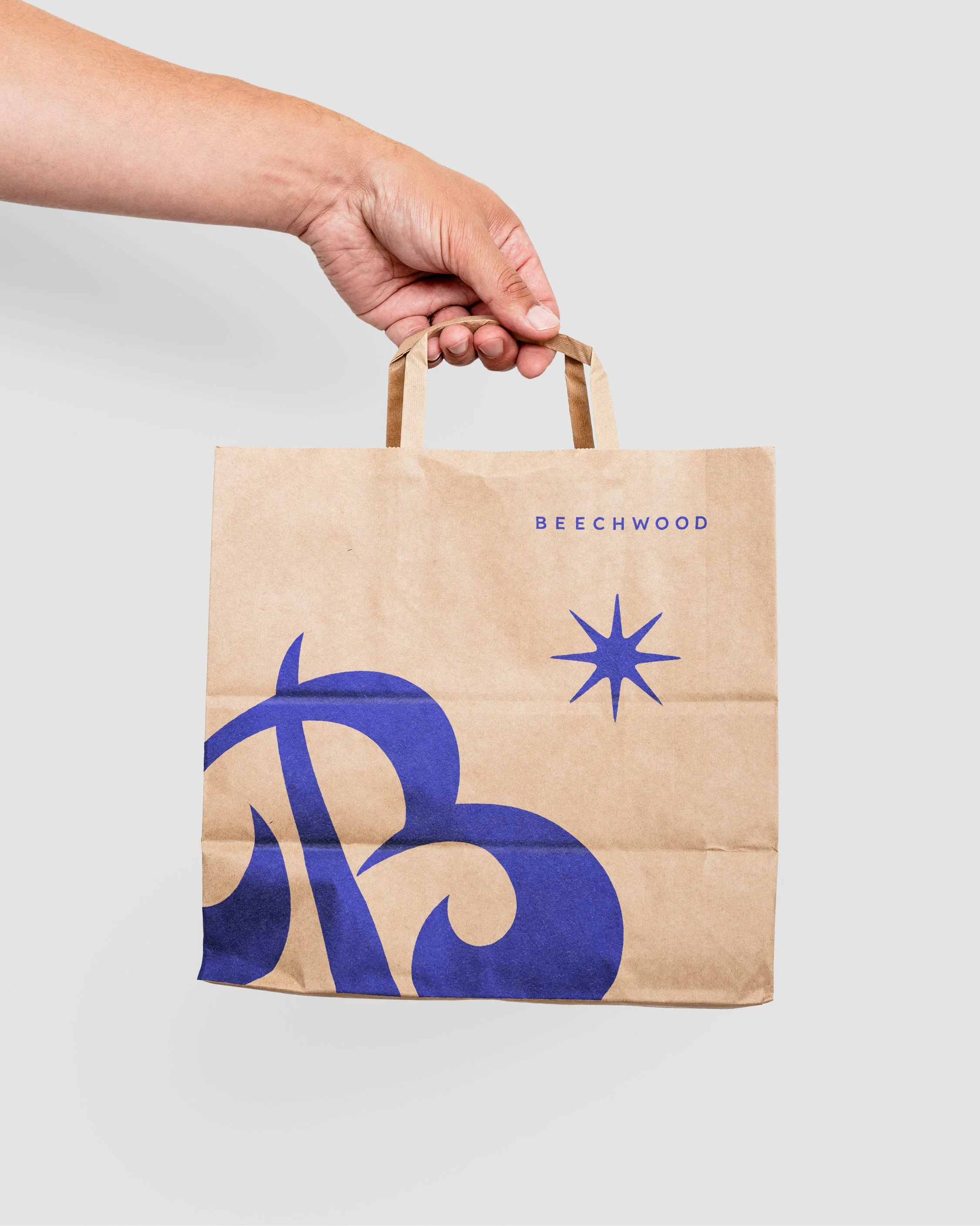
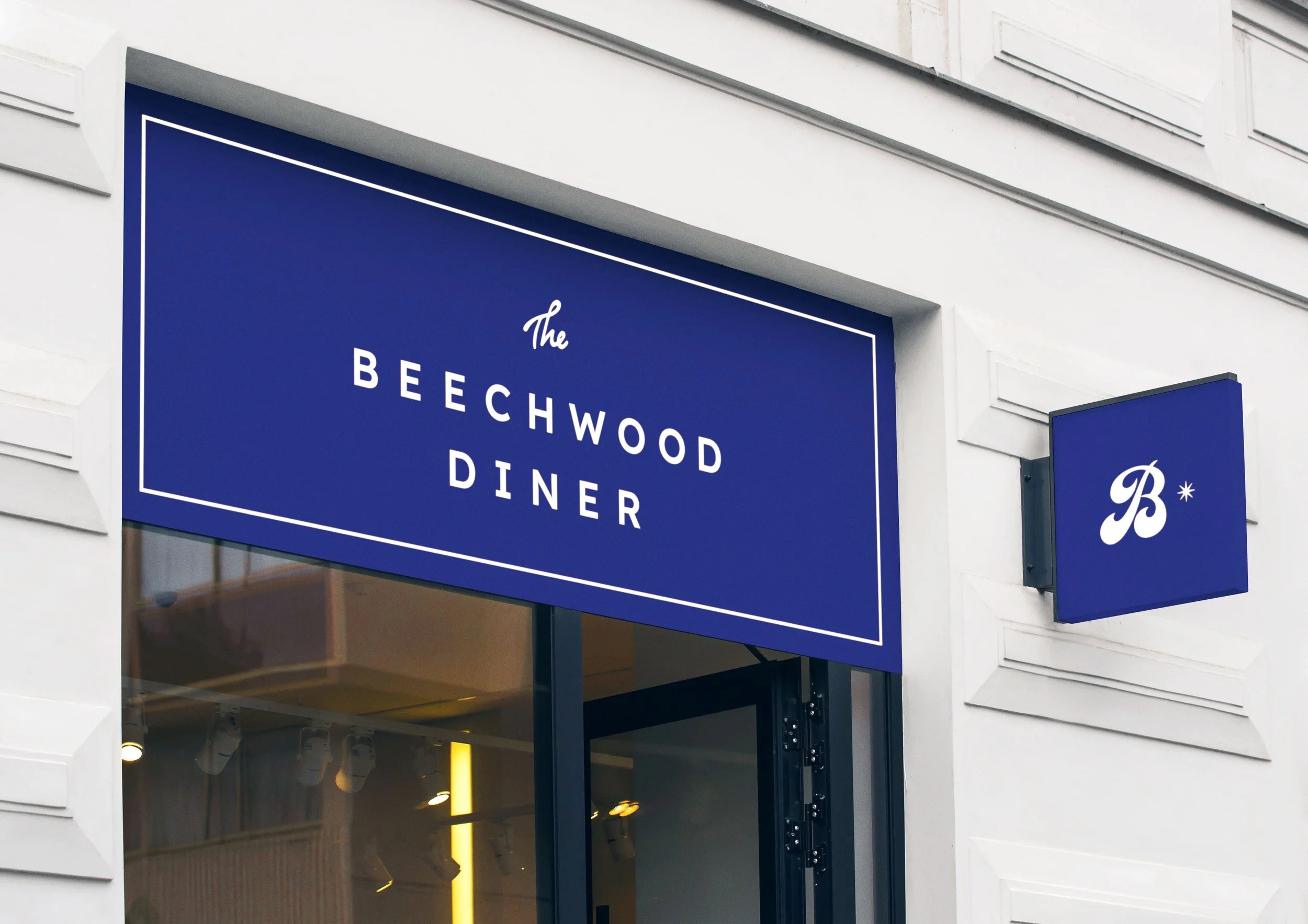
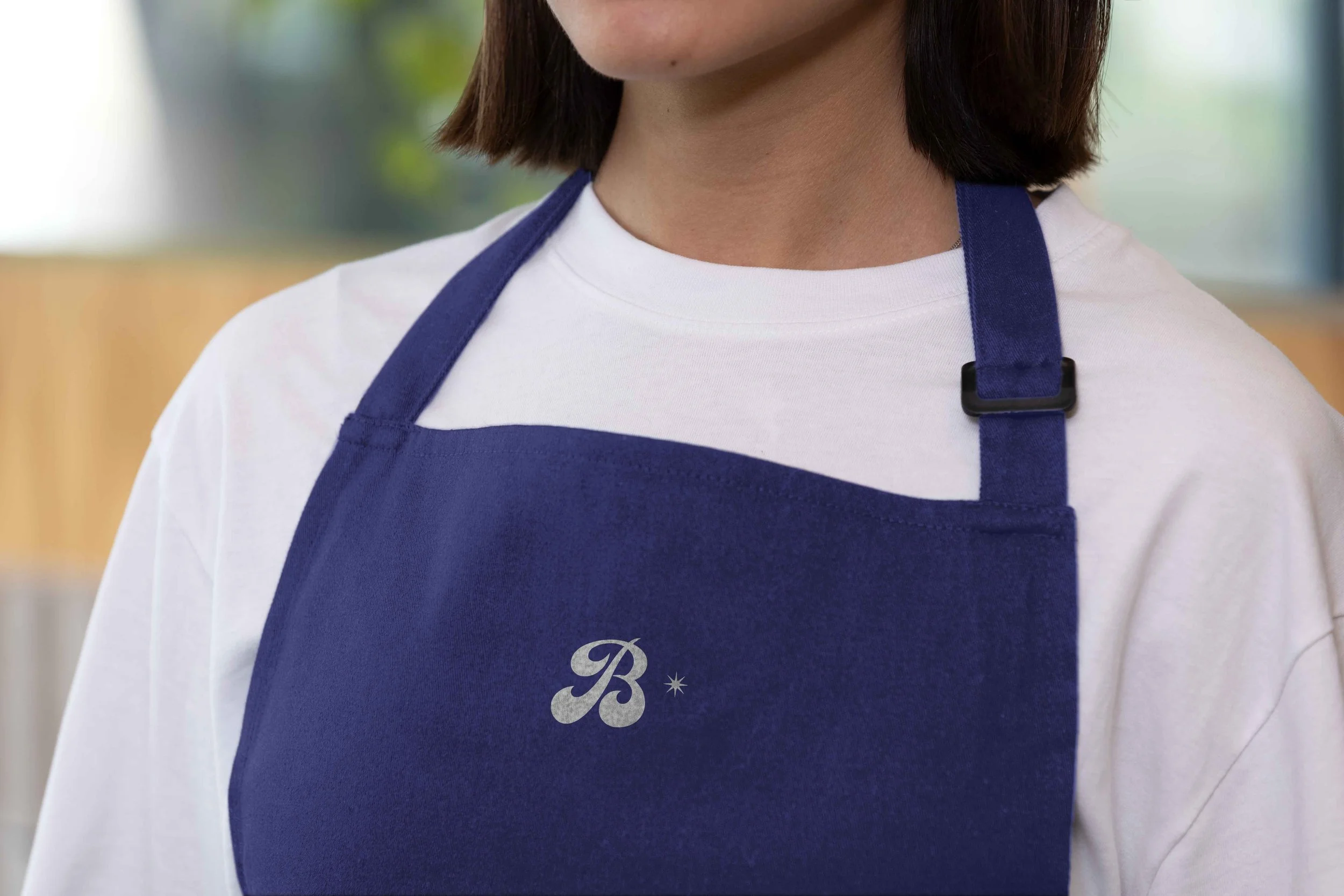
Design a brand that feels classic and clean, with just enough wink to feel modern. The Beechwood Diner sits at the intersection of nostalgia and refinement, so the identity needed to balance two opposing energies: the familiarity of the great American diner, and the considered, chef-led quality of the food coming out of the kitchen. A sans-serif wordmark grounds the brand in clarity and accessibility, while a retro script "B" — drawn from the late 19th-century sign-painter traditions — injects warmth, playfulness, and a sense of place.
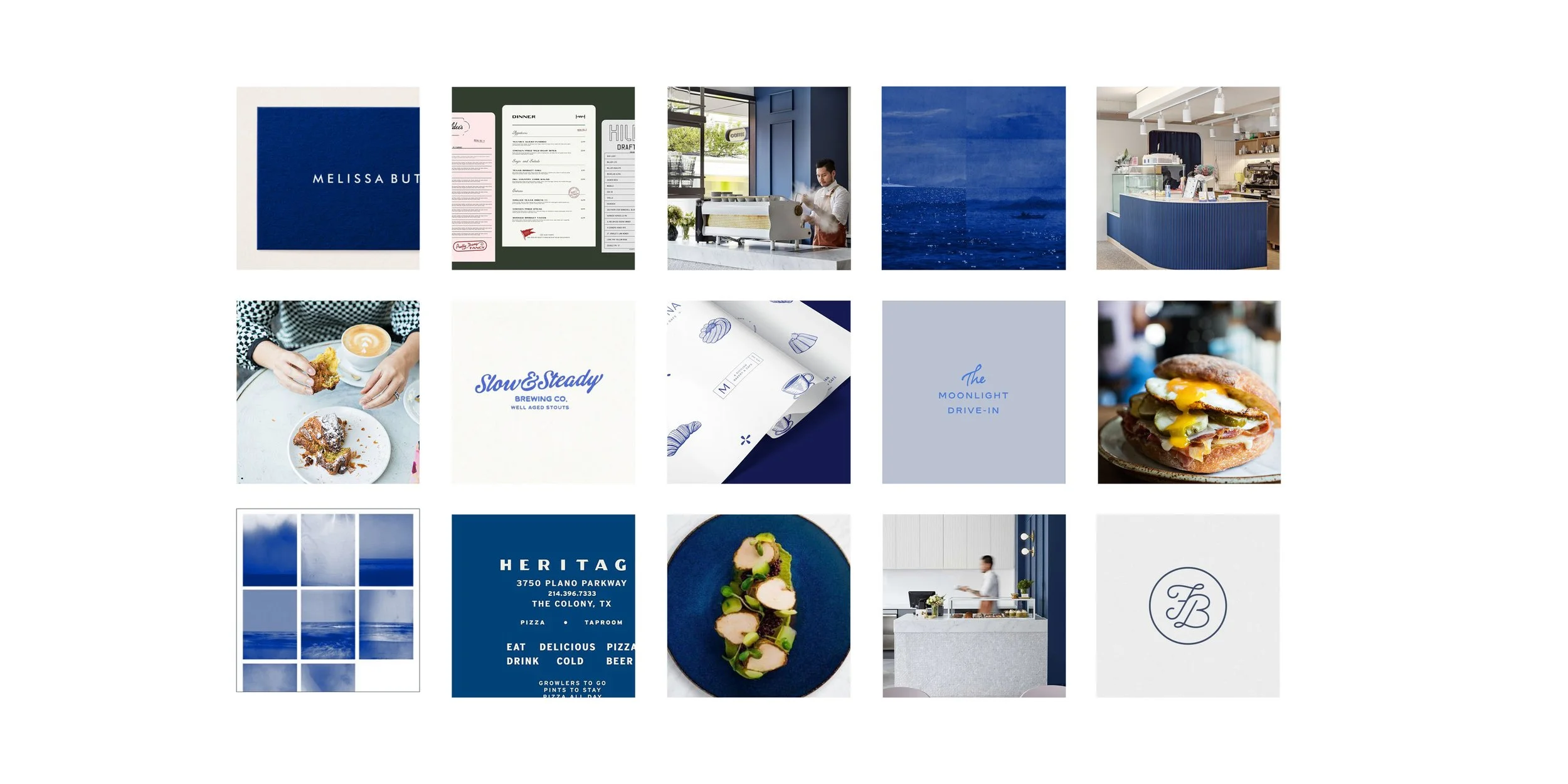
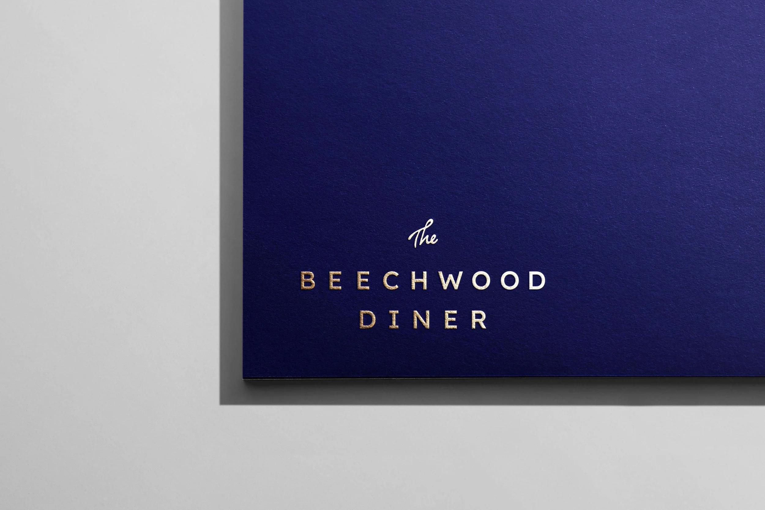
A colour palette anchored in deep royal blue (pulled directly from the diner's booths) creates instant ownership in a category typically dominated by red, chrome, and checkerboard. Cream, slate, and soft neutrals soften the palette, allowing the brand to feel approachable on a takeout bag, elegant on foil-stamped stationery, and unmistakable on the awning above the door. The result is a neighbourhood diner that looks like it has always been there — and like it could only be here.